October 27, 2012

Calculate an OLS regression using matrices in Python using Numpy

The following code will attempt to replicate the results of the numpy.linalg.lstsq() function in Numpy. For this exercise, we will be using a cross sectional data set provided by me in .csv format called “cdd.ny.csv”, that has monthly cooling degree data for New York state. The data is available here (File –> Download).

The OLS regression equation:

Y = X\beta + \varepsilon

where \varepsilon = a white noise error term. For this example Y = the population-weighted Cooling Degree Days (CDD) (CDD.pop.weighted), and X = CDD measured at La Guardia airport (CDD.LGA). Note: this is a meaningless regression used solely for illustrative purposes.

Recall that the following matrix equation is used to calculate the vector of estimated coefficients \hat{\beta} of an OLS regression:

\hat{\beta} = (X'X)^{-1}X'Y

where X = the matrix of regressor data (the first column is all 1’s for the intercept), and Y = the vector of the dependent variable data.

Matrix operators in Numpy

  • matrix() coerces an object into the matrix class.
  • .T  transposes a matrix.
  • * or dot(X,Y) is the operator for matrix multiplication (when matrices are 2-dimensional; see here).
  • .I takes the inverse of a matrix. Note: the matrix must be invertible.

Continue reading

February 21, 2012

Parallel computing with package ‘snowfall’

Lately I have been looking for ways to decrease the amount of time it takes me to run multiple regressions over a very large data set. There are several options that I am investigating to do this, and certainly more that I don’t know of yet.

  • Code more efficiently.
  • Compute several operations in parallel over a two or more CPU cores.
  • Tap into a network of computers, and further expand the number of CPU cores to parallelize calculations.

Because many of my computer jobs are “embarassingly parallel”, the options mentioned above would immediately improve the speed I can compute (and re-compute) jobs. This post will go through an example using the CRAN package snowfall to parallelize a computation over several CPU cores on the same computer (bullet #2 above).

The CRAN package snowfall is built to make it easy to create parallel processes. I recommend taking a look at the associated vignette and tutorial.

Before beginning to use snowfall, do the following:

  1. Upgrade to the latest version of R – as of this post version 2.14.1 (or the patched version of R-2.13.0 – available here). FYI – There is a bug in version 2.13.0 (for MS Windows 7) that prevents snowfall from operating smoothly.
  2. Install the latest version of the package snowfall ( install.packages('snowfall', dependencies = TRUE) )
  3. Find out how many cores you have on the CPU of the machine you will be using.  In my example below, I am using a machine with 8 CPU cores and running Windows 7.
  4. Convert any ‘for’ loops into a function that you can call using apply(). See my previous post that outlines this process.

Using snowfall: A simple example

The reason I put together this post is because I couldn’t easily find a ‘plug’n play’ code example in the existing online literature to execute the type of parallelization I wanted. Out of necessity I worked through the wrinkles and am now successfully utilizing multiple CPU cores in R.  –  Note: By default, R uses only one CPU core unless you explicitly code it to use multiple cores (as in this example). Continue reading

July 15, 2011

Why use R? A grad student’s 2 cents

One of the problems I faced this past year was deciding which software package to use — for statistical analyses, homework problems, and my thesis research. A handful of professors here use SAS, many use Stata, a few use Matlab, and one uses R (that I know of). After a semester using SAS, and despite having only one professor on the R “team” — I decided to learn R.

Here’s why:

  • R is free.  While I could get student discounts on SAS or Stata, or use the school computer lab, I like my software to be there for me always.  If I want to run a regression at 2:00 am using the wi-fi of a Holiday Inn Express, I should be able to run that awesome regression.  I can install R on every computer that I need (home, office, laptop, friends, enemies, etc.).  This is helpful because the I like to work in a variety of places, and having all my tools on my person is required.  *If I had to boil this list down to the one reason I’m using R right now, it’s because of price.  You can’t. beat. free.
  • R has really good online documentation; and the community is unparalleled.  One of the primary motivations for this blog is to give back to the R community that has helped me learn and appreciate the software.  I want to mitigate the fixed-costs of learning R, help others in their quest to tackle data-driven analyses, and spread the good word.  The more people who use R, the more people with which I can potentially collaborate.
  • I like the command-line interface.  You can use the command-line interface in other programs like SAS and Stata.  But, when you are starting out — is that really what you use?  It wasn’t for me.  Why?  Because I didn’t know any better — I was just starting out!  The command-line interface is perfect for learning by doing.  You can immediately see the results from inputting a single line of code.  If there are errors, you can fiddle with your code and re-hit [enter].  This is the way I learn things, and surely I’m not alone.
  • R is on the cutting edge, and expanding rapidly.  If you follow any of the online communities that work with R, you will notice all the new packages being rolled out — almost daily!  R is on the forefront of statistical methods, and can be integrated from any number of other languages – be it Python, Java, Fortran, etc.
  • The R programming language is intuitive.  One of the aspects I liked about R when I first started out is that it just worked.  I wrote a function that followed my thought process, and bam! – it worked.  Immediately it was improving my productivity, without having to know too much about coding or dig through a manual.
  • R creates stunning visuals.  See below; some of my favorites.  And I’m still a beginner.  Using Hadley Wickham’s ggplot2 and the stock imaging platform, it is straightforward to generate sharp diagrams.
  • R and LaTeX work together — seamlessly.  If you use LaTeX, you are in luck.  I am writing my thesis in LaTeX, and just recently stumbled upon R’s tikzDevice package.  This package outputs images as TikZ code for direct compilation in .tex.  For outputting multiple images, using loops, and reducing the file size of my thesis, this has been a huge plus.
  • R is used by practitioners in a plethora of academic disciplines.  R users come from myriad industries and academic departments, be it sociology, immunology, economics, statistics, paleontology, anthropology, finance, marketing analytics, etc.  This cross pollination is healthy for the enterprising student.  By seeing familiar concepts used in other disciplines, and through a different lens, it helps solidify your own understanding.  Furthermore, this expanded user base increases the likelihood that something useful to you will be added to the next CRAN package or version of R.
  • R makes you think.  Some statistical packages make it easy to perform many useful tasks via canned functions. For economists, Stata is one of those such programs.  However, being forced to code a procedure by hand, though more time consuming, helps make it “stick”.  And the more you get acquainted with R’s many packages, the more you will stumble upon a canned function that will do exactly what you want.  But even if that availability exists, R makes is relatively straightforward to code your own procedure, and then check to make sure the two routes return the same results.
  • There’s always more than one way to accomplish something.  Similar to the preceding point, I find it extremely helpful to tackle a problem two ways (or more), and make sure my results match.  When I find that they don’t, I am forced to really learn what’s going on “under the hood” — and in consequence, expand my knowledge of R and econometrics.
So, do a bit of research and make an informed decision about what software you invest the time and energy to learn.  If you do, I’m confident you’ll see the potential in R and give it a shot.

Did I forget anything?  — Why do you use R to dominate your data analysis?

Tags:
July 13, 2011

R: apply() + function = no need for loops

In my research, I am constantly running the same computation over every combination of month-day-year-hour in a given sample’s time period. Traditionally, this can be done using loops, like so:

R:

k = 2008       # year start
j = 1          # month start
i = 1          # day start
h = 1          # hour start

# start nested loops:
for (k in 2008:2010) {
for (j in 1:12) {
for (i in 1:31) {
for (h in 1:24) {

print(paste('The date is ',paste(j,i,k,sep='/'),' hour ',h,sep=''))

}}}}

However, there is a cleaner, more efficient way to go. That is, to write a function that takes the day, month, year, etc. as input parameters, and call it using apply(). For a great explanation and introduction to using apply(), sapply(), lapply(), and other derivatives of apply(), see this excellent poston Neil Saunders blog: “What You’re Doing is Rather Desperate”.

To follow our silly example from above, we could create a function that prints the date and hour:

dateprint = function(MM,DD,YR,HR) {
print(paste('The date is ',paste(MM,DD,YR,sep='/'),' hour ',HR,sep=''))
 }

Then we could call the function as follows:

k = c(2008:2010)       # year range
j = c(1:12)            # month range
i = c(1:31)            # day range
h = c(1:24)            # hour range

# Call function using apply() and defined parameters
output = apply(expand.grid(j,i,k,h), 1,
         function(x,y,z,a) dateprint(x[1],x[2],x[3],x[4]))

# Apply stores the output as a list
# I like to convert it to a dataframe for easier viewing and manipulation.
output=data.frame(output)

Notice that you are essentially giving apply() an “input matrix” created by expand.grid(); apply() takes parameters from each row of that “input matrix” and feeds them to our dateprint() function. You can tell apply() to take parameters from each column by changing the “1” to a “2” within your call of apply().
I am not too close with the back end of R, so I am not certain that using apply() will increase the computational efficiency of your code. That said, it is another approach to solving a common problem, and one I use often. Furthermore, it cleans up your code a scintilla.
Clean code = happy code.

Tags:
July 12, 2011

TikZ diagrams with R: loops with tikzDevice


Recently I needed to create a lot of similar charts for input into a LaTeX document.  In this post, I will show how I integrated the R package tikzDevice with usepackage{tikz} and a simple R loop to facilitate the task of creating tens (or hundreds) of publish-ready diagrams.  For an introduction to using tikzDevice, see this earlier post.

The approach I will use is as follows:

  1. Create a plot in R.
  2. Create a loop in R that will generate multiple diagrams for different subsets of my data.
  3. Integrate tikzDevice with the loop to output diagrams as TikZ code in a .tex file in the directory of my LaTeX document.
  4. Include the documents in my LaTeX file.

For this example, we’ll be using the panel.xls data set from Walter Enders’ web site, showing quarterly values of the real effective exchange rates (CPI-based) for Australia, Canada, France, Germany, Japan, Netherlands, the United Kingdom and the USA between Q1 1980 and Q1 2008. For more commentary, see page 245 of his text “Applied Econometric Time Series”, 3rd edition.

To quickly graph all the series together, we could do the following:

R:

# gdata helps read .xls files
require(gdata)
df = read.xls("http://cba.ua.edu/assets/docs/wenders/panel.xls", sheet = 1)

# a quick plot of all countries
df2 = ts(df, frequency = 4, start = c(1980, 1))
plot(df2[,-1], main = 'Quarterly Effective Exchange Rates, 1980-2008', col = 'blue')


Or, to create a chart similar to the one shown at the top of this post we could do the following:
Continue reading

Tags: , ,
June 29, 2011

TikZ diagrams with R: A Normal probability distribution function

You may have seen an earlier post where I went through some examples of how to create a normal distribution in LaTeX using TikZ. In this post, I will show a different way to accomplish a similar result using R and the package tikzDevice().

tikzDevice() is an R package that outputs any image from R as TikZ code in a .tex file. In order to include the outputted .tex file in you LaTeX document, you need to do two things:

  • add \usepackage{tikz} in the preamble to your LaTeX document.
  • add \include{normal_pdf} where you’d like your image (after you’ve created and outputted normal_pdf.tex from R, as shown below).

R:

# load tikzDevice package
require(tikzDevice)

# Choose boundaries to be shaded in blue
a = 0.5
b = 1.8

# creates x & y boundaries based on a and b parameters
x.val <- c(a,seq(a,b,0.01),b) 
y.val <- c(0,dnorm(seq(a,b,0.01)),0)

# choose the name and location for your .tex file
# it should be the same directory as your latex document
tikz( '/Users/kevingoulding/latex_documents/thesis/normal_pdf.tex' )

# plots a normal distribution curve
curve(dnorm(x,0,1),xlim=c(-3,3),main='The Standard Normal PDF',
	xlab = '$x$', ylab = '$f(x)$',
	frame.plot = FALSE, axes = FALSE)

# shades in a polygon underneath curve
polygon(x.val,y.val,col='skyblue')

# creates blank axes
Axis(side=1, labels=FALSE)
Axis(side=2, labels=FALSE)

# must turn device off to complete .tex file
dev.off()
Tags: , , ,
June 25, 2011

TikZ diagrams with R: tikzDevice

There are several options for integrating your R workspace with LaTeX. One of these is the R package tikzDevice that allows you to export images created in R as tikz code in a .tex file, for immediate use in a LaTeX document via the line \include{diagrams}.

A simpler way, the one we all start out with, is to export an image from R as a .pdf, then include it using the line \includegraphics{diagrams.pdf}. This is a pretty easy and straightforward workflow – so, why would I want to use tikzDevice?

There several advantages to converting your images into TikZ code directly from R:

  1. TikZ diagrams consist of vectors coded directly into your LaTeX document: there’s no loss of image resolution.
  2. The labels on TikZ diagrams match the font of your LaTeX document.
  3. Wonderful LaTeX equations can be effortlessly used as labels in your diagrams.
  4. You can harness the power of the loop in R to create a single .tex file containing many images.
  5. You can harness the power of the loop in R to add \caption{} and \label{} lines to all your images for immediate reference within LaTeX.
  6. You can include all these features and output via one line in LaTeX: \include{diagrams}.

A Simple Example

That being said, let’s export a TikZ scatterplot using the tikzDevicepackage. We will use data posted on Dr. Walter Enders web site.

Notice the fancy latex equations as labels on the plot.

R:

# gdata helps read .xls files
require(gdata)
df = read.xls("http://cba.ua.edu/assets/docs/wenders/arch.xls", sheet = 1)

# tikzDevice will export the plots as a .tex file
require(tikzDevice)

# choose a name and path for the .tex file
# folder should be the same as where your latex document resides
tikz( '/Users/kevingoulding/latex_documents/thesis/plot_with_line.tex' )

plot(df, xlab = "$\\alpha_t + \\hat{\\beta}X_t$", ylab = "$Y_t$",
            main = "$Y_t = \\alpha_t + \\hat{\\beta}X_t$")
abline(h = mean(df[,2]), col = "red", lwd = 2)

dev.off()					# must turn device off to complete .tex file

To include this diagram in your LaTeX document, simply add the line \include{plot_with_line} and compile. Don’t forget to include \usepackage{tikz} in the preamble. If you zoom in, you can see that we’ve labeled the plot and axes using LaTeX math language (amsmath).

A few things to be careful with as you try to code LaTeX equations from within R:

  • All backslashes need to be doubled. \ –> \\.
  • All equations still need to be bordered by $ on each side.

To be continued…

Tags: , ,
June 20, 2011

Differences-in-Differences estimation in R and Stata

{ a.k.a. Difference-in-Difference, Difference-in-Differences,DD, DID, D-I-D. }

DID estimation uses four data points to deduce the impact of a policy change or some other shock (a.k.a. treatment) on the treated population: the effect of the treatment on the treated.  The structure of the experiment implies that the treatment group and control group have similar characteristics and are trending in the same way over time.  This means that the counterfactual (unobserved scenario) is that had the treated group not received treatment, its mean value would be the same distance from the control group in the second period.  See the diagram below; the four data points are the observed mean (average) of each group. These are the only data points necessary to calculate the effect of the treatment on the treated.  The dotted lines represent the trend that is not observed by the researcher.  Notice that although the means are different, they both have the same time trend (i.e. slope).

For a more thorough work through of the effect of the Earned Income Tax Credit on female employment, see an earlier post of mine:

Calculate the D-I-D Estimate of the Treatment Effect

We will now use R and Stata to calculate the unconditional difference-in-difference estimates of the effect of the 1993 EITC expansion on employment of single women.

R:

# Load the foreign package
require(foreign)

# Import data from web site

require(foreign)

# update: first download the file eitc.dta from this link:
# https://docs.google.com/open?id=0B0iAUHM7ljQ1cUZvRWxjUmpfVXM
# Then import from your hard drive:
eitc = read.dta("C:/link/to/my/download/folder/eitc.dta")

# Create two additional dummy variables to indicate before/after
# and treatment/control groups.

# the EITC went into effect in the year 1994
eitc$post93 = as.numeric(eitc$year >= 1994)

# The EITC only affects women with at least one child, so the
# treatment group will be all women with children.
eitc$anykids = as.numeric(eitc$children >= 1)

# Compute the four data points needed in the DID calculation:
a = sapply(subset(eitc, post93 == 0 & anykids == 0, select=work), mean)
b = sapply(subset(eitc, post93 == 0 & anykids == 1, select=work), mean)
c = sapply(subset(eitc, post93 == 1 & anykids == 0, select=work), mean)
d = sapply(subset(eitc, post93 == 1 & anykids == 1, select=work), mean)

# Compute the effect of the EITC on the employment of women with children:
(d-c)-(b-a)

The result is the width of the “shift” shown in the diagram above.

STATA:

cd "C:\DATA\Econ 562\homework"
use eitc, clear

gen anykids = (children >= 1)
gen post93 = (year >= 1994)

mean work if post93==0 & anykids==0     /* value 1 */
mean work if post93==0 & anykids==1     /* value 2 */
mean work if post93==1 & anykids==0     /* value 3 */
mean work if post93==1 & anykids==1     /* value 4 */

Then you must do the calculation by hand (shown on the last line of the R code).
(value 4 – value 3) – (value 2 – value 1)

Run a simple D-I-D Regression

Now we will run a regression to estimate the conditional difference-in-difference estimate of the effect of the Earned Income Tax Credit on “work”, using all women with children as the treatment group. This is exactly the same as what we did manually above, now using ordinary least squares. The regression equation is as follows:

work = \beta_0 + \delta_0post93 + \beta_1 anykids + \delta_1 (anykids \times post93)+\varepsilon

Where \varepsilon 
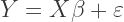
is the white noise error term, and \delta_1 is the effect of the treatment on the treated — the shift shown in the diagram. To be clear, the coefficient on (anykids \times post93) is the value we are interested in (i.e., \delta_1).

R:

eitc$p93kids.interaction = eitc$post93*eitc$anykids
reg1 = lm(work ~ post93 + anykids + p93kids.interaction, data = eitc)
summary(reg1)

The coefficient estimate on p93kids.interaction should match the value calculated manually above.

STATA:

gen interaction = post93*anykids
reg work post93 anykids interaction
Tags: ,
June 19, 2011

TikZ for economists: A how-to guide with examples

Below is a guide I created to assist economists in quickly creating economics diagrams using the package TikZ in LaTeX.


Thoughts, comments, ideas? Let me know; I’m always appreciative of feedback. Correspondence via e-mail can be directed to kevingoulding [at] gmail {dot} com.

Tags: , ,
June 17, 2011

TikZ diagrams for economists: A normal pdf with shaded area.

I have been dabbling with the TikZ package to create some diagrams relevant to a first year microeconomics course. The following diagram of the probability density function (pdf) of a normal distribution may be useful to others wishing to integrate similar diagrams into their LaTeX documents or Beamer presentations. To use, insert the following code anywhere you like within a .tex document (you must include \usepackage{tikz} in your header):

The Cumulative Density of y

INSERT INTO .TEX DOCUMENT

\begin{tikzpicture}
% define normal distribution function 'normaltwo'
    \def\normaltwo{\x,{4*1/exp(((\x-3)^2)/2)}}

% input y parameter
    \def\y{4.4}

% this line calculates f(y)
    \def\fy{4*1/exp(((\y-3)^2)/2)}

% Shade orange area underneath curve.
    \fill [fill=orange!60] (2.6,0) -- plot[domain=0:4.4] (\normaltwo) -- ({\y},0) -- cycle;

% Draw and label normal distribution function
    \draw[color=blue,domain=0:6] plot (\normaltwo) node[right] {};

% Add dashed line dropping down from normal.
    \draw[dashed] ({\y},{\fy}) -- ({\y},0) node[below] {$y$};

% Optional: Add axis labels
    \draw (-.2,2.5) node[left] {$f_Y(u)$};
    \draw (3,-.5) node[below] {$u$};

% Optional: Add axes
    \draw[->] (0,0) -- (6.2,0) node[right] {};
    \draw[->] (0,0) -- (0,5) node[above] {};

\end{tikzpicture}

The Probability of u Falling Between x and y

INSERT INTO .TEX DOCUMENT

\begin{tikzpicture}
% define normal distribution function 'normaltwo'
    \def\normaltwo{\x,{4*1/exp(((\x-3)^2)/2)}}

% input x and y parameters
    \def\y{4.4}
    \def\x{3.4}

% this line calculates f(y)
    \def\fy{4*1/exp(((\y-3)^2)/2)}
    \def\fx{4*1/exp(((\x-3)^2)/2)}

% Shade orange area underneath curve.
    \fill [fill=orange!60] ({\x},0) -- plot[domain={\x}:{\y}] (\normaltwo) -- ({\y},0) -- cycle;

% Draw and label normal distribution function
    \draw[color=blue,domain=0:6] plot (\normaltwo) node[right] {};

% Add dashed line dropping down from normal.
    \draw[dashed] ({\y},{\fy}) -- ({\y},0) node[below] {$y$};
    \draw[dashed] ({\x},{\fx}) -- ({\x},0) node[below] {$x$};

% Optional: Add axis labels
    \draw (-.2,2.5) node[left] {$f_Y(u)$};
    \draw (3,-.5) node[below] {$u$};

% Optional: Add axes
    \draw[->] (0,0) -- (6.2,0) node[right] {};
    \draw[->] (0,0) -- (0,5) node[above] {};

\end{tikzpicture}

The TikZ code snippet above is meant to be dropped into a .tex document and work without any further “tinkering”. Please let me know if this is not the case!

Tags: , ,